Chupan Chupai is a short film installation
that combines environment design and cinema in an exhibition format. The
project was developed for the ‘Future Perfect’ exhibition as part of the 2013 Architecture Triennale in Lisbon, Portugal and was presented by DAZED as part of the Visionaries series.
SYNOPSIS
In a near future heavily influenced by the imminent boom of the Indian subcontinent, an emerging technology and economic superpower a new digital city has developed. The film follows a group of young children as they play a game of hide and seek (Chupan Chupai) in the bustling streets of this smart city. Through their play the children discover how to hack the city, opening up a cavernous network of hidden and forgotten spaces, behind the scenes of everyday streets.
The project was shot on location in India and uses a mixture of animation and visual effects to embellish the design of the city and locations that are pictured.
Based on a short story by Tim Maly
Directed by FACTORY FIFTEEN
Produced by Liam Young
View the film by clicking the link below - Vimeo
(all the information above is from the filmmakers description)
(all the information above is from the filmmakers description)
______________________________________________________________________________
My observations are below:
Visually stimulating. Intense color from the first opening sequence - red, yellow, pink, green, blue. Joy. Imagination. Playfulness.
The color acknowledges and isolates each child running through this city. It individualizes them while at the same time making them part of this group of children. One of my favorite frames occurs when the girl in the fuchsia scarf attempts to blend in with the wall behind her (at 2:25), or when the girl in the yellow scarf and the boy with the violet scarf stand together on the stairs and look out onto the city. Yellow and purple are complimentary colors and create a harmonious pairing visually. These colors help to create a sense of stability and peace within the frame. They reinforce each other and all the colors seem to do in this short beautiful film.
(UPDATE: Click the link below to see the blog post by mathzara on the film)
Chupan Chupai: A Study in Environmental Design
(UPDATE: Click the link below to see the blog post by mathzara on the film)
Chupan Chupai: A Study in Environmental Design
 |
| Film still @ 3:24 |
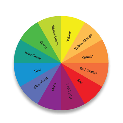 | |||
| Color wheel showing complimentary colors opposite each other (yellow/violet) |


