Showing posts with label color. Show all posts

Saturday, April 27, 2019

Emalox - Norwegian enamelware


I always loved this set of small anodized aluminum dessert plates and bowls my mother had in her home. They are one of my favorite mid-century modern items she had. Luckily she recently let me have them and we now lovingly use them whenever we have dessert. It is especially nice to eat ice-cream out of the bowls, since the aluminum keeps the ice-cream cold. But my favorite thing about them is the range of colors - I am missing a few specific colors (lime green for example) but eating a special birthday cake on top of a bright purple plate just makes you smile.

The enamelware is from a company called Emalox in Norway and they were manufactured between 1960-1969. You can see some other examples of Engø's designs here: https://digitaltmuseum.no

The designer of these bowls was Bjørn Engø (1920-1981), was an interior designer and enamel artist. He was educated at the National Arts and Crafts School in Oslo. In the mid 1950s Engø started designing bowls, plates and ashtrays in enameled aluminum for Emalox at Ryen in Oslo. The basic forms of these products, and their fresh colors became very popular and are today sought-after collectors items.

 The set pictured below is selling on 1stdibs.com for $4,437 for 52 pieces


Friday, April 26, 2019

Behr Paint - Color Expert

Well, no need for anyone else to apply to Behr's call for a Color Explorer this summer.  This would be a dream come true for me.


One of the locations would be Banff, Canada which has been on my bucket list since, well, since forever.  What name would I choose for the color of the lake? 

Jewel blue? 
Glacier milk?

Tuesday, March 22, 2016

Harvard Library Pigment Library


© President and Fellows of Harvard College


I just learned about this amazing pigment collection at Harvard!  Guess a road trip is in order to see this rare collection of around 2500 different pieces. There are a lot of colors that I don't even know what they are; "Quercitron" (a yellow dye from black oak), or "Cochineal" (which comes from squished beetles - for real).

Wednesday, November 26, 2014

GREAT UNUSUAL STRANGE WEIRD COLOR NAMES THAT YOU PROBABLY DON'T KNOW

I saw an article recently that listed several unusual color names - I had never heard of most of them.  I decided to do a little more research and found a ton more! I knew several of them: Titian (a warm red), Vermilion (bright orange-red), and Verdigris (greenish-blue poisonous pigment on copper) and Malachite (a green mineral) but not the others.

Here's a test - without looking them up (!) - try to guess what the colors are -reply to the post and next post I will add the colors and descriptions.


  1. SARCOLINE
  2. COQUELICOT
  3. SMARAGDINE
  4. MIKADO
  5. GLAUCOUS
  6. WENGE
  7. FULVOUS
  8. XANADU
  9. FALU
  10. EBURNEAN
  11. AMARANTH
  12. MALACHITE
  13. GAMBOGE
  14. FALLOW
  15. CAPUT MORTUUM
  16. VERMILION
  17. VERDIGRIS
  18. TITIAN
  19. BISQUE
  20. PUCE
  21. CATTLEYA
  22. SMALT
  23. DAMASK
  24. BITTERSWEET
  25. BYZANTIUM
  26. PAVO
  27. AUREOLIN
  28. BOLE
  29. FILEMOT
  30. RUFOUS
  31. VINACEOUS
  32. HARLEQUIN
  33. MELICHROUS
  34. EAU DE NIL
  35. CIEL
  36. FELDGRAU
  37. SOLFERINO
  38. JASMINE OR JESSAMY

Friday, November 14, 2014

Page from a letter to his paint dealer by Eugene Delacroix
October 28, 1827

How fun it was to see this image of a letter by Delacroix posted today by my friend Jim (fellow graduate art history student at the University of Oregon in the 1980s). He is known to have a paint dealer named Etienne-Francois Haro (1827-1897) but Delacroix wrote this letter in 1827, and Haro was born in 1827. It was most likely addressed to Jacques Francois Haro (1797-1844).
My translation is poor but I can read that he wanted 6 bladders/tubes of naples yellow and 2 bladders/tubes of cobalt blue, and 2 bladders/tubes of fishing black.

Note: Collapsible tin paint tubes were invented by American artist John Rand, in 1841, which resulted in more pre-mixed colors being available in a medium which was convenient for painting outdoors (en plein-air painting).


 Delacroix's Palette

"My freshly arranged palette, brilliant with contrasting colors, is enough to fire my enthusiasm," he noted in his Journal in 1850.

The painter René Piot, who was Andrieu’s student, collected, in a book entitled Les Palettes de Delacroix (1930) all of Delacroix’s reflections on colors, color preparation, and especially, the arrangement of his colors on his palette, which he worked on meticulously until his health faltered. 


Monday, May 19, 2014

Newly discovered book on COLOR


The book was called the Traité des couleurs servant à la peinture à l’eau, and it was written in 1692 by a man who identifies himself in the book only as “A. Boogert.”

"It was, in essence, a hand-written textbook on the creation of different colors using water, and meant to be studied by any and all painters and artists who would be fortunate enough to actually get their hands on it."

Other writers have compared it to its contemporary equivalent, the Pantone Color Guide, which was published for the first time in 1963 (and with less than stellar color reproductions compared to today's standards).

I am assuming since it has been out of circulation for over 300 years, the colors still seem vibrant. It is currently located in Bibliothèque Méjanes in Aix-en-Provence, France, which is of course, where Vincent van Gogh lived for a while (so obviously I need to plan a trip there).


(Original article found on Colossal - Colossal Site)

Friday, April 25, 2014

Chupan Chapai - a visually intense and colorful short film

Chupan Chupai is a short film installation that combines environment design and cinema in an exhibition format. The project was developed for the ‘Future Perfect’ exhibition as part of the 2013 Architecture Triennale in Lisbon, Portugal and was presented by DAZED as part of the Visionaries series. 

SYNOPSIS
In a near future heavily influenced by the imminent boom of the Indian subcontinent, an emerging technology and economic superpower a new digital city has developed. The film follows a group of young children as they play a game of hide and seek (Chupan Chupai) in the bustling streets of this smart city. Through their play the children discover how to hack the city, opening up a cavernous network of hidden and forgotten spaces, behind the scenes of everyday streets.

The project was shot on location in India and uses a mixture of animation and visual effects to embellish the design of the city and locations that are pictured.

Based on a short story by Tim Maly
Directed by FACTORY FIFTEEN
Produced by Liam Young
 
View the film by clicking the link below - Vimeo 
(all the information above is from the filmmakers description)
 ______________________________________________________________________________
My observations are below:

Visually stimulating. Intense color from the first opening sequence - red, yellow, pink, green, blue. Joy. Imagination. Playfulness.  

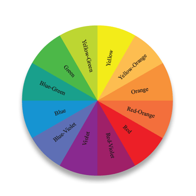
The color acknowledges and isolates each child running through this city. It individualizes them while at the same time making them part of this group of children. One of my favorite frames occurs when the girl in the fuchsia scarf attempts to blend in with the wall behind her (at 2:25), or when the girl in the yellow scarf and the boy with the violet scarf stand together on the stairs and look out onto the city. Yellow and purple are complimentary colors and create a harmonious pairing visually. These colors help to create a sense of stability and peace within the frame. They reinforce each other and all the colors seem to do in this short beautiful film.


(UPDATE:  Click the link below to see the blog post by mathzara on the film)
Chupan Chupai: A Study in Environmental Design


Film still @ 3:24
Color wheel showing complimentary colors opposite each other (yellow/violet)


Tuesday, August 27, 2013

Great hotels with color and art


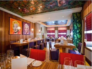
 This hotel, The Ring, in Vienna, Austria is so vibrant and colorful. This is a shot of their restaurant. Most of the examples in this article in CN Traveler look wonderfully eclectic and interesting. Here is the link to their site The Ring Hotel Vienna.

Sunday, July 21, 2013

Pantone Color Projects


Check out these fun Pantone-themed color projects (you have to be a little Pantone obsessed to make these I think) but they certainly are fun!


I have added a little info about Pantone here (from Wikipedia):

Pantone Inc. is a corporation headquartered in Carlstadt, New Jersey. The company is best known for its Pantone Matching System (PMS), a proprietary color space used in a variety of industries, primarily printing, though sometimes in the manufacture of colored paint, fabric, and plastics.
The company's primary products include the Pantone Guides, which consist of a large number of small (approximately 6×2 inches or 15×5 cm) thin cardboard sheets, printed on one side with a series of related color swatches and then bound into a small "fan deck".

The idea behind the PMS is to allow designers to "color match" specific colors when a design enters production stage, regardless of the equipment used to produce the color. This system has been widely adopted by graphic designers and reproduction and printing houses. 

and here is a link to Pantone's web site  - Pantone

Wednesday, May 15, 2013

Color in India

Panorma of Jodhpur (from: http://en.wikipedia.org/wiki/Jodhpur)

from http://www.indiamarks.com/jodhpur-india-the-blue-city/

photo by izzet keribar   


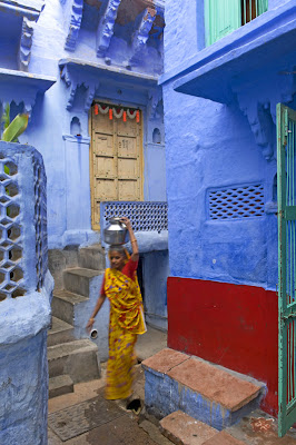
Looking for some images today of aerial views of cities, I came across the top photo of Jodhpur in Rajasthan, India.  Stunned to say the least, a city in blue, it propelled me to look into this interesting city and its choice of blue exteriors.

Here is some information about the city

Jodhpur is the second largest city in Rajasthan in India and is also known as the blue city because the color gives an indigo aura to it with blue colored houses surrounding the Mehrangarh Fort. Also known as the Sun City due to its perennial sunny weather, it receives sparse rainfall and is located in the Thar Desert. Jodhpur is a famous tourist attraction and offers myriad places of interest that have significant historical importance. It is also famous for its well preserved forts that are adorned with exquisite intricate carvings and pieces of art. The city is teeming with bazaars and crowded with tourists and is comparatively more populated than other cities in Rajasthan.

Some ideas for why the buildings are painted blue:

The district of Jodhpur that is painted light blue is generally where the highest cast of Hindus live. This high cast is referred to as "Brahmins" and traditionally were priests and town leaders. The color blue in India is commonly associated with royalty and power . One motivation for the blue painting of Jodhpur is that the higher cast Brahmins wished their dwellings to be of the Royal color and this is the commonly accepted reason.

The residents of Jodhpur are extremely proud of the city's blue color. When pushed for an answer as to why the city is blue they usually respond by saying it keeps the buildings cool during the punishing summer. This answer usually puzzles visitors who fail to understand why Rajasthan's other great cities are not also painted blue. 

The true reason for Jodhpur's blue color is more practical motivated than artistic reasoning. The dry arid environment of which Jodhpur is located is blighted by termites. The small insects damaged and destroyed the traditional building techniques which involved the exterior being coated in lime wash. It was discovered that the termites were repelled by copper salt compounds and these were added in low concentrations to the lime washes. Copper solutions under certain conditions produce blue compounds and this was true of the materials applied to the exterior of Jodhpur's houses.
 
The Brahmin class could afford the copper sulphate lime washes and applied it to their houses which were concentrated in just one area of the city. It is therefore commonly thought that the Brahmins painted their houses the blue color to emphasize their royal connection when in actual fact they were the ones only able to afford the specialist exterior paint. The blue of Jodhpur is best viewed from Meherangarh Fort where an entire side of the city is painted in this one uniform blue color.


Thursday, April 25, 2013

Hemp yarn

I always seem to gravitate towards displays where items in color are displayed in various ways. Here, the yarn is displayed in a case where you absolutely have to notice the rainbow effect. Does it make me want to buy them?  Yes.  Did I? No. But I thought about it and instead took a photograph.  


Lovely batch of pastels

Once again, I was drawn to the section of bold colors in Blick Art Supplies on Bond Street in Manhattan. I wanted to buy each and every one of these pastels but opted for photographing them instead.


Saturday, January 12, 2013

Hotels in Color

Use of dramatic color in Hotels...

Here are some photos of hotels around the world. The first four are of Missoni Hotels in Kuwait and Edinburgh. The next few are from Brussels, Paris, Brooklyn, Singapore, Athens and Palm Springs. Don't stay in boring hotel - stay at a colorful one!
I plan to stay in the one from Brooklyn on my next visit there sometime within the next few months!

Kuwait
Kuwait


Edinburgh

Edinburgh


Brussels


Paris


Brooklyn

Brooklyn


Singapore


Athens, Greece


Palm Springs, CA


(read about their color plan here)


Sunday, January 1, 2012

Poisonous and Saturated COLORS (in frogs)


Vibrant but toxic, there are more than 100 species of poison dart frogs, varying in color and pattern. Color shades vary among frogs within a species. It is the skin that contains the frog's poison. They do not manufacture their poison themselves, but rather it is theorized that they take the toxins from the ants, mites, and beetles on which they live. They absorb the insects' poisons into their body, which are immune to the poison. The poison is stored in skin glands just beneath the frog's epidermis... (information from wikipedia ).

These beautiful colors are warnings to potential predators that the frogs are poisonous. Other species, such as monarch butterflies, also sport bright colors to advertise their toxicity. Several species of non-poisonous frogs evolved with similar coloring to avoid being eaten. The fact that the more saturated the color is, the more poisonous the frog, is an interesting concept.  

Color saturation refers to how vivid and intense a color is 
and also refers to the vibrancy and purity of color.
 
 Golden Dart Frog - its color from left (20% saturation, at right 96%)

 Bright Yellow 2022-30 Benjamin Moore

 Granular Poison Frog (from Costa Rica and Panama)

 Orange 2011-10 Benjamin Moore

 
Granular frog at varying levels of saturation

Blue Poison Dart Frog (the blue here is at 87% saturation)

This saturated blue was impossible to find in a paint sample but I have a couple that are close.
Blue is paired nicely with grayish/whites but also with its opposite, orange.
The blue here is"evening blue - 2066-20"  and the orange below is called "orange parrot - 2169-20".


Thursday, December 22, 2011

Christmas Colors

Traditionally the colors of Christmas are red and green. I am not sure why red and green have been used for everything relating to Christmas (wrapping paper, bows, ribbons, decorations etc.) The color green is used as a reference for the evergreen tree and the idea that green can be thought of as a symbol for life, nature, growth, rebirth AND a now a symbol of ecology as well.  Red is used as the color of Santa's suit (why red? - see below) - red is a color of extremes - love, danger, anger, adventure AND a religious color (Christ, blood, crucifixion).

The tradition of Santa's suit being red actually derives from the Coca Cola company advertising campaign in the 1930s who thought Santa should be dressed in red rather than green. See: Coca-Cola-Santa.
So, if you like the traditional color palette of red, green with perhaps silver and gold accents - keep the tradition going. However, are some new palettes to consider that 
I found on Porter House Designs that you might like to try. Here is one of my favorites from her site...although I personally might swap out the black from a soft, dark brown.


If you are thinking of using Feng Shui principles - here are some ideas. 

Keep a sense of balance in mind when you place and decorate your tree and home, and you'll find it becomes a meaningful gathering space for family and friends.
Fire - red, orange, purple, pink (to activate personal energy- use in south areas of home)
Earth - yellow, beige, sand (create stability and harmony in relationships - use in center of home)
Metal  -white, grey, metallic (to bring clarity and focus - use in west area of home)
Water - black, blue (to bring a refreshing calmness into home - use in north areas of home)
Wood -  brown, green (to bring a sense of vibrant health - use in east areas of home)

During the holidays, this might mean adding candles throughout your home. However, if you have an unbalanced Fire feng shui element during Christmas season you risk creating an energy that promotes burn-out and even emotional outbursts. The low energy people often feel after the Christmas holidays is often created by an unbalanced fire element in their homes. Be mindful about balancing the strong feng shui Fire element of the Christmas season with a cooler color scheme, such as soothing light blue (feng shui Water element color), cool silver or gray and calm white (feng shui Metal element colors). 

Monday, September 5, 2011

See! Colour!

The following link will take you to an amazing exhibition on color, showing now in Sweden.


From their web site: 

"For SEE! COLOUR! James Turrell has created several large installations including a permanent Skyspace, a walk-in-colour sculpture, a so called Ganzfeld (18 x 12 x 10 m), a Wedgework, Bindu Shards, the groundbreaking one-person experience in a spherical chamber, a Dark Space and a Tall Glass.
Additionally, a range of existing works by Turrell are exhibited, including models and pictures of Roden Crater and four Holograms."


It's only a 6 hour train ride from Oslo to Stockholm... should I go???

Thursday, August 11, 2011

Fabulous Colored Chair


Love this wonderful, quirky, fun chair designed by Anthony Hartley

The chair itself has a name "Mr. Smith the Second", which I discovered after reading Style Factory's
blog. I think this chair would just be totally fun to sit in.


From his website:
Anthony Hartley
Oak Cottage, Oak Street, Oxenhope BD22 9JR
tel: 07758 779183

Anthony will be launching Mr and Mrs Smith the second, Edna and Sidney from stand G1 at Tent London , Truman Brewery in Spitalfields,  22 - 25 September 2011


Tuesday, July 26, 2011

Color in Architecture

This is the most amazing door I have ever seen ... colored slides with pantone colors...just lovely.  I found this on the Design Sponge blog (Design Sponge). the photograph was taken by Ingrid Heiss.  It is from the house of Armin Blasbichlerin in South Tyrol in Northern Italy.

Armin Blasbichlerin is an architect in Germany- http://www.arminblasbichler.com/

Of course, as I started thinking about the light coming through the door - I realized that light is about color and color changes with the quality of light.

More to come..

Thursday, April 14, 2011

Shopping by Color


What a great concept - photographing items in a grocery store by their color and packaging - what I really would like to see are all the contents of the basket as well.

These images are part of a group show of photographs at the Robert Mann Gallery in New York titled "Food for Thought" that runs through May 11, 2011 
(These photographs are by Marco Ugolini and Pedro Motta)