Wednesday, February 5, 2014

Winter White

One year I had a client who asked me to "...just paint her walls white". Hmmmm. I showed her one brochure I had which had 3 pages of samples of "white". She looked stumped. I ended up choosing a white for her that had some warmth to it based on the colors of her furniture and decor but it was the first time I had understood the complexity of the problem of "white". 

Below is a quick search for "white" on the Sherwin Williams site.  I got 9 pages of results.
I realize for many people the subtlety of all the varying shades of "white" is so nit-picky and subtle that just picking any will suffice. But I do think it is important to choose a white that works well with your interior space.  If you have a lot of cool tones and metal in your home, then a cooler white will be best. If you have warmer tones, then a warmer white (Dover White by SW or Linen White by Benjamin Moore for example) will work well.  

(above: Benjamin Moore White Dove)


Below are some links to sites that might help with your "white" paint dilemmas.


In terms of fashion, you do read about "winter white" in terms of clothing - "summer whites" being clearly different than "winter whites". These examples about have a yellowish, warm hue which is definitely different than a cooler, bluer summer white (see below).


Friday, January 3, 2014

Biblical blue dye discovered

Researchers have discovered a blue dye described in the Bible. It was found on a piece of wool cloth which is thought to be almost 2,000 years old. It was discovered in a cave in the West Bank. The caves are the same caves where the Dead Sea Scrolls were found. Blue and purple were considered the most precious of dyes, this one made from snails. I have included a link below for more information. 

Elusive biblical blue dye found

Tuesday, August 27, 2013

Great hotels with color and art


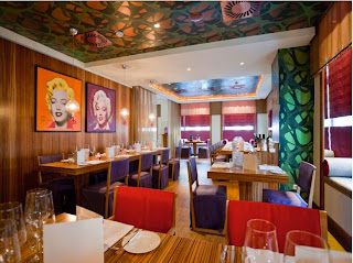
 This hotel, The Ring, in Vienna, Austria is so vibrant and colorful. This is a shot of their restaurant. Most of the examples in this article in CN Traveler look wonderfully eclectic and interesting. Here is the link to their site The Ring Hotel Vienna.

Sunday, July 21, 2013

Pantone Color Projects


Check out these fun Pantone-themed color projects (you have to be a little Pantone obsessed to make these I think) but they certainly are fun!


I have added a little info about Pantone here (from Wikipedia):

Pantone Inc. is a corporation headquartered in Carlstadt, New Jersey. The company is best known for its Pantone Matching System (PMS), a proprietary color space used in a variety of industries, primarily printing, though sometimes in the manufacture of colored paint, fabric, and plastics.
The company's primary products include the Pantone Guides, which consist of a large number of small (approximately 6×2 inches or 15×5 cm) thin cardboard sheets, printed on one side with a series of related color swatches and then bound into a small "fan deck".

The idea behind the PMS is to allow designers to "color match" specific colors when a design enters production stage, regardless of the equipment used to produce the color. This system has been widely adopted by graphic designers and reproduction and printing houses. 

and here is a link to Pantone's web site  - Pantone

Wednesday, May 15, 2013

Color in India

Panorma of Jodhpur (from: http://en.wikipedia.org/wiki/Jodhpur)

from http://www.indiamarks.com/jodhpur-india-the-blue-city/

photo by izzet keribar   


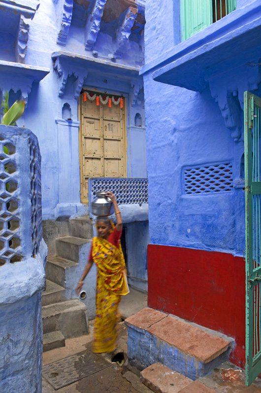
Looking for some images today of aerial views of cities, I came across the top photo of Jodhpur in Rajasthan, India.  Stunned to say the least, a city in blue, it propelled me to look into this interesting city and its choice of blue exteriors.

Here is some information about the city

Jodhpur is the second largest city in Rajasthan in India and is also known as the blue city because the color gives an indigo aura to it with blue colored houses surrounding the Mehrangarh Fort. Also known as the Sun City due to its perennial sunny weather, it receives sparse rainfall and is located in the Thar Desert. Jodhpur is a famous tourist attraction and offers myriad places of interest that have significant historical importance. It is also famous for its well preserved forts that are adorned with exquisite intricate carvings and pieces of art. The city is teeming with bazaars and crowded with tourists and is comparatively more populated than other cities in Rajasthan.

Some ideas for why the buildings are painted blue:

The district of Jodhpur that is painted light blue is generally where the highest cast of Hindus live. This high cast is referred to as "Brahmins" and traditionally were priests and town leaders. The color blue in India is commonly associated with royalty and power . One motivation for the blue painting of Jodhpur is that the higher cast Brahmins wished their dwellings to be of the Royal color and this is the commonly accepted reason.

The residents of Jodhpur are extremely proud of the city's blue color. When pushed for an answer as to why the city is blue they usually respond by saying it keeps the buildings cool during the punishing summer. This answer usually puzzles visitors who fail to understand why Rajasthan's other great cities are not also painted blue. 

The true reason for Jodhpur's blue color is more practical motivated than artistic reasoning. The dry arid environment of which Jodhpur is located is blighted by termites. The small insects damaged and destroyed the traditional building techniques which involved the exterior being coated in lime wash. It was discovered that the termites were repelled by copper salt compounds and these were added in low concentrations to the lime washes. Copper solutions under certain conditions produce blue compounds and this was true of the materials applied to the exterior of Jodhpur's houses.
 
The Brahmin class could afford the copper sulphate lime washes and applied it to their houses which were concentrated in just one area of the city. It is therefore commonly thought that the Brahmins painted their houses the blue color to emphasize their royal connection when in actual fact they were the ones only able to afford the specialist exterior paint. The blue of Jodhpur is best viewed from Meherangarh Fort where an entire side of the city is painted in this one uniform blue color.


Thursday, April 25, 2013

Hemp yarn

I always seem to gravitate towards displays where items in color are displayed in various ways. Here, the yarn is displayed in a case where you absolutely have to notice the rainbow effect. Does it make me want to buy them?  Yes.  Did I? No. But I thought about it and instead took a photograph.  


Lovely batch of pastels

Once again, I was drawn to the section of bold colors in Blick Art Supplies on Bond Street in Manhattan. I wanted to buy each and every one of these pastels but opted for photographing them instead.


Saturday, January 12, 2013

Hotels in Color

Use of dramatic color in Hotels...

Here are some photos of hotels around the world. The first four are of Missoni Hotels in Kuwait and Edinburgh. The next few are from Brussels, Paris, Brooklyn, Singapore, Athens and Palm Springs. Don't stay in boring hotel - stay at a colorful one!
I plan to stay in the one from Brooklyn on my next visit there sometime within the next few months!

Kuwait
Kuwait


Edinburgh

Edinburgh


Brussels


Paris


Brooklyn

Brooklyn


Singapore


Athens, Greece


Palm Springs, CA


(read about their color plan here)


Sunday, December 9, 2012

Color of the Year for 2013

 Pantone's Color of the Year 2013

Emerald Green

Hmmmm....emerald green? I am now wondering how consumers will react to this color. I am not too sure if most women (men?) can pull off wearing this color. While I think it will be interesting for accessories (purse, laptop or cell phone case), I think this burst of bold color will be too much for most women.


(Also, note that Emerald Green was the go-to color in 2011 after Angelina Jolie wore green earrings to the 2011 Golden Globes. So, why choose this color again for 2013)?


According to Pantone's web site:

Emerald, a lively, radiant, lush green, as the Color of the Year for 2013.
The 2012 Color of the Year, PANTONE 17-1463 Tangerine Tango, a spirited, reddish orange, provided the energy boost we needed to recharge and move forward. Emerald, a vivid, verdant green, enhances our sense of well-being further by inspiring insight, as well as promoting balance and harmony.
Most often associated with brilliant, precious gemstones, the perception of Emerald is sophisticated and luxurious. Since antiquity, this luminous, magnificent hue has been the color of beauty and new life in many cultures and religions. It’s also the color of growth, renewal and prosperity – no other color conveys regeneration more than green. For centuries, many countries have chosen green to represent healing and unity.


Here is a photo however, from Michael Kors Holiday 2012 collection.


What do you think of this new color trend?

Also, it is winter now (is this a winter color?). I am thinking that a green that is supposed to inspire or to be a color of renewal might be more muted or more spring/sage green. 

Friday, October 12, 2012

Color in Indian Architecture


Benjamin Moore - Pink Flamingo with their color palette

Found this wonderful building online this evening (Hawa Mahal - which translates to "Palace of Winds") and was captivated by its elaborate facade and lovely, colorful interior spaces. It is located in Jaipur, India and was built in 1799. The facade has been compared to a honeycomb with its 953 windows decorated with latticework.  It is built out of red and pink sandstone.