Monday, April 29, 2019

As an art historian and curator, I look for images every day. I try to find the best images that available, so that the faculty where I work will show the best possible reproductions in their art history classes to their students. I make sure the images are optimized and cataloged correctly.

Nine times out of ten, I find images that are most definitely NOT the right color. Perhaps the photograph was taken with a poor quality camera, in poor lighting conditions, and/or the person posting it just can't see color well (or doesn't care), and/or doesn't know how to fix it. 
Not everyone has Photoshop, nor do they necessarily know how to use it.

This artist, Corinne Vionnet, has created a video that I think captures this dilemma for me.  Check it out here: Corinne Vionnet - it is a short video of 94 images that clearly shows the many variations of Monet's "Impression, Sunrise" found online.


Screen grab from video

Saturday, April 27, 2019

Emalox - Norwegian enamelware


I always loved this set of small anodized aluminum dessert plates and bowls my mother had in her home. They are one of my favorite mid-century modern items she had. Luckily she recently let me have them and we now lovingly use them whenever we have dessert. It is especially nice to eat ice-cream out of the bowls, since the aluminum keeps the ice-cream cold. But my favorite thing about them is the range of colors - I am missing a few specific colors (lime green for example) but eating a special birthday cake on top of a bright purple plate just makes you smile.

The enamelware is from a company called Emalox in Norway and they were manufactured between 1960-1969. You can see some other examples of Engø's designs here: https://digitaltmuseum.no

The designer of these bowls was Bjørn Engø (1920-1981), was an interior designer and enamel artist. He was educated at the National Arts and Crafts School in Oslo. In the mid 1950s Engø started designing bowls, plates and ashtrays in enameled aluminum for Emalox at Ryen in Oslo. The basic forms of these products, and their fresh colors became very popular and are today sought-after collectors items.

 The set pictured below is selling on 1stdibs.com for $4,437 for 52 pieces


Friday, April 26, 2019

Behr Paint - Color Expert

Well, no need for anyone else to apply to Behr's call for a Color Explorer this summer.  This would be a dream come true for me.


One of the locations would be Banff, Canada which has been on my bucket list since, well, since forever.  What name would I choose for the color of the lake? 

Jewel blue? 
Glacier milk?

Tuesday, May 24, 2016

New article on the history of color in art (from artsy.net)


A brief history of color in art (click link to read article)

I actually have a nice sized library of books on color - here are few of the titles that are still available (via amazon.com). There are many others, in particular, ones that discuss only a certain color (blue for example), but these are a great place to get started on learning about color.

Color: A Natural History of the Palette 

The Brilliant History of Color in Art


Interaction of Color (Albers)

Pantone: the Twentieth Century in Color


Colors: The Story of Dyes and Pigments


Tuesday, March 22, 2016

Harvard Library Pigment Library


© President and Fellows of Harvard College


I just learned about this amazing pigment collection at Harvard!  Guess a road trip is in order to see this rare collection of around 2500 different pieces. There are a lot of colors that I don't even know what they are; "Quercitron" (a yellow dye from black oak), or "Cochineal" (which comes from squished beetles - for real).

Wednesday, November 26, 2014

GREAT UNUSUAL STRANGE WEIRD COLOR NAMES THAT YOU PROBABLY DON'T KNOW

I saw an article recently that listed several unusual color names - I had never heard of most of them.  I decided to do a little more research and found a ton more! I knew several of them: Titian (a warm red), Vermilion (bright orange-red), and Verdigris (greenish-blue poisonous pigment on copper) and Malachite (a green mineral) but not the others.

Here's a test - without looking them up (!) - try to guess what the colors are -reply to the post and next post I will add the colors and descriptions.


  1. SARCOLINE
  2. COQUELICOT
  3. SMARAGDINE
  4. MIKADO
  5. GLAUCOUS
  6. WENGE
  7. FULVOUS
  8. XANADU
  9. FALU
  10. EBURNEAN
  11. AMARANTH
  12. MALACHITE
  13. GAMBOGE
  14. FALLOW
  15. CAPUT MORTUUM
  16. VERMILION
  17. VERDIGRIS
  18. TITIAN
  19. BISQUE
  20. PUCE
  21. CATTLEYA
  22. SMALT
  23. DAMASK
  24. BITTERSWEET
  25. BYZANTIUM
  26. PAVO
  27. AUREOLIN
  28. BOLE
  29. FILEMOT
  30. RUFOUS
  31. VINACEOUS
  32. HARLEQUIN
  33. MELICHROUS
  34. EAU DE NIL
  35. CIEL
  36. FELDGRAU
  37. SOLFERINO
  38. JASMINE OR JESSAMY

Friday, November 14, 2014

Page from a letter to his paint dealer by Eugene Delacroix
October 28, 1827

How fun it was to see this image of a letter by Delacroix posted today by my friend Jim (fellow graduate art history student at the University of Oregon in the 1980s). He is known to have a paint dealer named Etienne-Francois Haro (1827-1897) but Delacroix wrote this letter in 1827, and Haro was born in 1827. It was most likely addressed to Jacques Francois Haro (1797-1844).
My translation is poor but I can read that he wanted 6 bladders/tubes of naples yellow and 2 bladders/tubes of cobalt blue, and 2 bladders/tubes of fishing black.

Note: Collapsible tin paint tubes were invented by American artist John Rand, in 1841, which resulted in more pre-mixed colors being available in a medium which was convenient for painting outdoors (en plein-air painting).


 Delacroix's Palette

"My freshly arranged palette, brilliant with contrasting colors, is enough to fire my enthusiasm," he noted in his Journal in 1850.

The painter René Piot, who was Andrieu’s student, collected, in a book entitled Les Palettes de Delacroix (1930) all of Delacroix’s reflections on colors, color preparation, and especially, the arrangement of his colors on his palette, which he worked on meticulously until his health faltered. 


Sunday, June 8, 2014

Color Palettes within Famous Portraits from the History of Art

Girl with the Red Hat, Johannes Vermeer, Dutch
c. 1665-1666, Oil on panel, 9 1/8 x 7 1/8"
National Gallery of Art, Washington D.C.
(Image courtesy of http://www.nga.gov)


COLOR PALETTE


EXPLANATION OF COLOR 

Vermeer was a Dutch painter with only 34 works that survive and/or are attributed to him.  All of his paintings, no matter how large or small (this is one the smallest of his portraits), in addition to having a quality about them that is quite difficult to describe well, also have an attention to color that is quite extraordinary.

In this painting, red, white, and blue are the three main colors with gold and green providing the color for the background.  Obtaining paint in the 17th century wasn't as easy as it is today. There was a limited range of colors available and painters had to prepare the paint themselves after purchasing pigments - usually from an apothecary. Ultramarine was a rare color, made from crushed lapis lazuli, thus very expensive but Vermeer used this color often in his work. Vermeer was a skilled master at mixing colors to achieve a harmony of values and shades in each painting. We can assume he understood Leonardo da Vinci's ideas about color, the most notable being the idea that objects will take on color/values of adjacent objects. Just like painters from the 1300s (Trecento) in Italy, Vermeer used green to depict skin tones. In addition, he used transparent glazes to finish a painting.
'
The main colors he used were:

1) Ultramarine 
2) Green Earth
3) Vermillion
4) Red Lake
5) Yellow Earth
6) Charcoal Black
7) Lead White
For a wonderful and detailed disucssion of Vermeer's use of color click the link below to read more on the National Gallery of Art, London's site:

Monday, May 19, 2014

Newly discovered book on COLOR


The book was called the Traité des couleurs servant à la peinture à l’eau, and it was written in 1692 by a man who identifies himself in the book only as “A. Boogert.”

"It was, in essence, a hand-written textbook on the creation of different colors using water, and meant to be studied by any and all painters and artists who would be fortunate enough to actually get their hands on it."

Other writers have compared it to its contemporary equivalent, the Pantone Color Guide, which was published for the first time in 1963 (and with less than stellar color reproductions compared to today's standards).

I am assuming since it has been out of circulation for over 300 years, the colors still seem vibrant. It is currently located in Bibliothèque Méjanes in Aix-en-Provence, France, which is of course, where Vincent van Gogh lived for a while (so obviously I need to plan a trip there).


(Original article found on Colossal - Colossal Site)

Friday, April 25, 2014

Chupan Chapai - a visually intense and colorful short film

Chupan Chupai is a short film installation that combines environment design and cinema in an exhibition format. The project was developed for the ‘Future Perfect’ exhibition as part of the 2013 Architecture Triennale in Lisbon, Portugal and was presented by DAZED as part of the Visionaries series. 

SYNOPSIS
In a near future heavily influenced by the imminent boom of the Indian subcontinent, an emerging technology and economic superpower a new digital city has developed. The film follows a group of young children as they play a game of hide and seek (Chupan Chupai) in the bustling streets of this smart city. Through their play the children discover how to hack the city, opening up a cavernous network of hidden and forgotten spaces, behind the scenes of everyday streets.

The project was shot on location in India and uses a mixture of animation and visual effects to embellish the design of the city and locations that are pictured.

Based on a short story by Tim Maly
Directed by FACTORY FIFTEEN
Produced by Liam Young
 
View the film by clicking the link below - Vimeo 
(all the information above is from the filmmakers description)
 ______________________________________________________________________________
My observations are below:

Visually stimulating. Intense color from the first opening sequence - red, yellow, pink, green, blue. Joy. Imagination. Playfulness.  

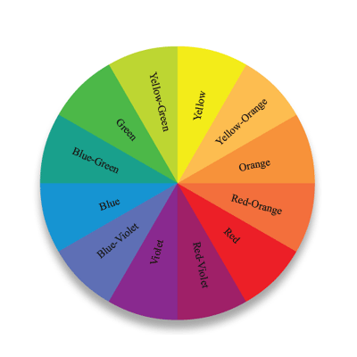
The color acknowledges and isolates each child running through this city. It individualizes them while at the same time making them part of this group of children. One of my favorite frames occurs when the girl in the fuchsia scarf attempts to blend in with the wall behind her (at 2:25), or when the girl in the yellow scarf and the boy with the violet scarf stand together on the stairs and look out onto the city. Yellow and purple are complimentary colors and create a harmonious pairing visually. These colors help to create a sense of stability and peace within the frame. They reinforce each other and all the colors seem to do in this short beautiful film.


(UPDATE:  Click the link below to see the blog post by mathzara on the film)
Chupan Chupai: A Study in Environmental Design


Film still @ 3:24
Color wheel showing complimentary colors opposite each other (yellow/violet)